Monday, May 30, 2011

Bathroom Blues

I hope you all had a nice Memorial Day Weekend!  We sure did.  We got to meet our friends' sweet new baby girl!  She is beautiful!  I did a little bit of furniture shopping--more on that later this week!  We shared a few good meals with good friends.  I got to relax and catch-up on my blog reading.  And, I got to enjoy the pool for the first time this year!  It was really nice to decompress from my crazy work schedule.  

I showed you our paint samples yesterday.  Have you figured out that my favorite color is blue?


After my prime sun hours today, I set to work painting the powder room.  We ultimately chose Atmospheric, one of the Behr Premium Colors at Home Depot.  In the past, I've always used Benjamin Moore or Sherwin Williams paints.  This time I used the Behr Premium Plus Ultra paint (aka "Paint & Primer In One"), and I was very pleased!  It generally covered in one coat, and it's a much better price than the other choices.  I will definitely use it again. 


It is really a little more gray than it shows in the first picture.  This shows a truer color~


Next step is to find a mirror.  Then, we'll finish out with a new light fixture and sink faucet.  I'm excited to complete the project!

Again, I hope you all had a happy and safe Memorial Day Weekend!

Happy Memorial Day!

This is what I'm up to today...

Choosing paint color for our powder room.  Hopefully, I'll have finished (paint) pictures for you tomorrow.
HAPPY MEMORIAL DAY!

Thursday, May 26, 2011

Lovely Living Rooms

Sorry about the lack of posting this week.  Work has been crazy!  I check out Decorpad.com about once a week to browse the new images.  Here are a few of my favorite living rooms that I noticed this week.  I think I'm attracted to their tranquility.  They all look like such soothing spaces.  Give me a good book, a blanket and a cup of coffee, and I'd be in heaven in any of these rooms!


{All images via decorpad.com}

Sunday, May 22, 2011

Kitchen Updates

I spend a lot of time in my kitchen.  I enjoy cooking, and because we have an open floor plan, I can usually be found sitting at my kitchen table watching TV and playing on the computer while my husband watches TV from our living room.  I went through some old pictures the other day and realized how far we'd come with a few simple kitchen updates.

I took these first pictures of our house when we were house hunting.  The kitchen was painted gold with a tumbled marble backsplash.  It was very nice, but it just wasn't "us"~


The first change we made was to remove the pot rack.  Next we replaced the backsplash with subway tile.  The tile guy thought we were a little crazy to replace a tumbled marble backspash with ceramic subway tile, but the change made us very happy. 


You probably noticed that the kitchen is white in this picture.  That's a long story, but let's just say there was a big miscommunication with a painter who didn't understand the difference between the dining room and the breakfast room.  I quickly chose a new color, a pale grey-green.  I also had a nice Pottery Barn rug (the Sheffield Rug, I think) I loved that coordinated perfectly with the wall color.  Unfortunately, about two weeks after I bought it, Maizy decided to eat the corner of it one night while I was at the gym.  I eventually sold it for a super cheap price on Craigslist.


I liked the color a lot, but with the open floor plan, it really limited my options in the adjoining living room.  I wanted to pull more blues into the living room, so I decided that my best option was to go with a brown.  I chose Tamarind by Benjamin Moore.


Next we added our Pottery Barn light fixture (and I should have checked Overstock.com first!).  And, most recently, we added a new natural fiber rug that I found on Overstock.com for $88!


Because I did the painting myself, we made all of the changes I mentioned in this post for under $1000.  I think we got a lot of bang for our buck! 

While it's not quite my dream kitchen...I would love to have black granite countertops and an island that people could sit around...I do love my kitchen. 

Thursday, May 19, 2011

Dining Delight

I've told you before how much I love IO Metro, a modern home furnishings store started in my home state, Arkansas.  It's where we found a great deal on the new print in our living room.

I've also told you how much I love At Home in Arkansas.  They recently featured the home of the founders of IO Metro, which was remodeled and decked out entirely in furnishing from IO Metro.  After the article was published, the IO Metro blog featured posts on each room of the house. 

One of my favorite rooms in the house is the dining room.  Here are a few of the pics:


All images via IO Metro Blog

My favorite design idea from the room is that they removed the shelves from the built-ins, backed them with custom shaped mirror and inset the dramatic buffet lamps.  I think it's such a classy way to dress up dated built-ins!  And, it really brightens up the room.  I also really love the custom banister on the staircase in the background of the last picture.  More on that later, though. 

I must say, though, I would love to see a rug added to the dining room.  Maybe that's old-fashioned of me, though...

Finally!

It's finally here!  I've only waited years...

We're Verizon customers.  I was so excited when they announced they were getting the iPhone.  When my contract was up on Monday, I got online, ordered, and her she is!


Now, I'm busy adding my apps.  Any suggestions?  What's your favorite app?

Tuesday, May 17, 2011

Beautiful Little Bathrooms

Now that we've suddenly jumped into an update of our powder room, I decided I needed some images for inspiration.  I checked out Decorpad and found a few beautiful images.

I love the wallpaper/stencil of this first picture and the sconces.  Unfortunately, our walls are textured, so wallpaper or stencil are not options.  I also don't want to spend the money to have wiring re-routed for sconces.    I love the shade of blue, though...  And, how about the fabulous Greek key handles on the cabinet?

Design by Lisa Palmer

I have the same likes about this second picture...  And, I love the marble vanity!

Design by Ashley Goforth

While this third image isn't as high gloss as the first two images, it's much closer to something that I could emulate.  I expect to keep our white pedestal sink, but we plan to replace lighting, paint and the fixture.  I have a feeling that Overstock.com and I will be very good friends over the next few weeks!

Design by Tish Key ID

Sunday, May 15, 2011

Mirror, Mirror on the Wall

Like most houses built in the 1990s, our bathrooms all have (insert sarcastic tone) super fabulous glued to the wall mirrors.  This is a picture of our half bath that I took the day I first looked at the house.


I've been super busy at work lately.  I had to go in this morning for a few hours.  Before I left I rattled off a list of "possible activities" for Eric while I was gone.  One of those "possible activities" included removing the mirror off of the wall.  I didn't really think he would do it, but just in case, my parting instruction was that if he started on the mirror, don't forget to take pictures for the blog!  He's such a good husband!

He googled other DIYs and got plenty of ideas.  He started by covering the entire mirror with contact paper that he bought on clearance at the grocery store.


Eric then loosened all of the edges with a putty knife.  He worked around the edges trying to loosen the whole mirror, but it wouldn't budge. 

When that didn't work, he got creative and tried to heat the glue with my hair dryer and then used a piece of picture hanging wire to slice/floss it off the wall.  No such luck.  The wire actually dried into the glue and wouldn't come out.  He then actually slammed it with a mallet...and it didn't even break.  He then slowly worked the screwdriver around the mirror, and it eventually popped off the wall.


And, the backside of the mirror... with the melted-in wire...


In case you were want a closer glimpse of the superfly wallpaper found lurking behind the mirror...


Now, I'm on a mission to find a new mirror and light fixture.  The mirror needs to be at least a 24 x 36 rectangle.  I like round mirrors best, but round won't work in the dimensions of the space.  I also plan to paint the bathroom, but I haven't decided what color, yet.  If any of you have any mirror, color or light fixture recommendations, please, please share in the comments below!

Wednesday, May 11, 2011

Lands' End Home...say what?

UPDATE:  Just got a Lands' End email.  25% off everything plus free shipping with promotion code: EVERYTHING and pin code: 1555 through May 16!

Let me be really honest here, Lands' End is not what immediately comes to mind when I think of bedding, towels or home furnishings.  But after I ordered one of their great totes for my best friend's baby girl last fall, I started receiving their Lands' End Home catalogs.  And, this is one mailing list I'm glad I ended up on! 

And the best part is that they have free shipping on all orders now through May 17th when you use the promotion code: ADIRONDACK and pin code: 1113!

Here are some of my favorite items~

Comes in several great colors!  I love linen bedding.  So luxurious!

I love the print on the duvet. 

It's on sale!


What a great hostess gift!

Monday, May 9, 2011

Skirted Console Tables

I've told you about my home's foyer (or lack thereof) here and here.  I already own an entry table, so I knew that if I wanted to do something differently, it has to be budget friendly.  After seeing the skirted bedside tables that have been popping up on design blogs for a while now, I wondered if a skirted console table had been done?  A little Google-ing later, I realized I did NOT have an original idea!  But, the pictures I found were just the inspiration I needed.  Here are a few of the images that are inspiring me~


{design by Phoebe Howard}


Now, the bigger decisions- what size to make the console table and what fabric!

Are you liking skirted tables or do you prefer the richness of a wood table?

Thursday, May 5, 2011

White & Bright

As an Arkansas girl in Texas, I keep up my subscription to At Home in Arkansas, which features many of the beautiful homes across the State of Arkansas.  Even if you're not from Arkansas, you should consider a subscription (they're really cheap!) or at least visit the online site, which features images from each month's publication.  It seems that At Home gets first dibs at a lot of Tobi Fairley's (another Arkansas girl) work before it makes it's way into the bigger national publications.

This month's edition featured this beautiful kitchen on the cover.  It is too pretty not to share!


I think I'd be scared to get it dirty! 

Have a good weekend!

Wednesday, May 4, 2011

Now that's class, people!

I've been looking for a print to hang over the sofa table behind my couch for a while now.  Shortly after the first of this year, I found a print at Ballard Designs that I liked, but it was at the very top end of what I wanted to spend plus I would have to pay shipping on it.  So, the search began and ended very quickly.

I found the same print at I.O. Metro, which has two stores in my area.  It was the same price as the Ballard print but at least I wouldn't have to pay shipping.  I shop at I.O. Metro pretty frequently, so I knew they did sales from time to time.  Usually those sales only apply to one type of product, though, so I had to wait until the art sale came along.

Finally, a few weeks ago, art went on sale for 20% off for the weekend.  I called my store.  They had the print and said they would put it on hold for me.  Here it is in our living room.  It's propped for now; I'll probably hang it this weekend.


I'm so excited that the wall is finally filled!

But, the funny part is that the print is 54" x 54".  I was talking to the sales girl at the counter before I paid. 

Me: Now this will go in the back of our SUV won't it?

Sales Girl: Sure.  Unless it's a 4Runner.  I have a 4Runner, and I've tried.  It won't fit.

Me: Shit.  We have a 4Runner.

Sales Girl:  Well, we can Saran-Wrap it to the top.

Next thing I knew...

We're so classy!

If you aren't familiar with I.O. Metro check out one of their stores or their website.  They carry lots of great, modern products at great prices!  They also have a great blog!  The company was founded in my home state, Arkansas, and has slowly expanded across the southeast part of the country.  They recent brought on Vern Yip as their celebrity endorser!  Check them out!  And, they have art and mirrors on sale for 20% off right now!

Rachel Berry

I'm a complete Gleek.  Well, really maybe I'm just a Blaine-iac.  No, I love all of Glee.  Two weeks ago the show centered on the lead character, Rachel Berry--played by the beautiful Lea Michelle, contemplating a nose job.  Rachel was obsessed with getting her nose fixed until the New Directions (name of the Glee club) rallied around her to convince her that it's great to be who you are naturally. 


I've never contemplated having a nose job.  I've never really contemplated plastic surgery period.  I'm far from perfect, but as you can probably tell from my blog, I love buying things for my house far more than I would love to buy perfect features.

Then last night that changed.  As I was working out at the gym doing chest flys, I dropped a dumbbell on my face.  It hit my nose and my forehead.  Ouch!  I went to the emergency room (for the first time ever!) and was relieved that I did not have a concussion.

But then the doctor said those words:

"You're nose is broken.  Give it a week or two for the swelling to go away, then you'll probably want to consult a plastic surgeon." 

Of course I made him show me the xrays.  It definitely now has a lump.  It's still swollen enough that you can't really see it yet other than on the xray, though. 

I'm anxious to learn my fate.

The damage could have been far worse.  I was only using a 15-lb weight at the time; I often use much heavier weights.  And, I was using one with rubber end caps as opposed to a solid metal dumbbell.  I'm very relieved that it is no worse than it is. 

It's just funny how quickly things can change...when life throws a dumbbell your way!


Monday, May 2, 2011

The Bees Knees

Warning:  This is a very petty product post!

I don't consider myself a product junkie.  I have a few favorites that I stick to religiously, but otherwise I'm not really loyal.  If it's new and cool and I've got some extra change in my pocket, I'll may try it.  But I don't certainly don't try every new thing that hits the shelves. 

I also don't try to pretend like I'm a real blonde.  I like to look like one, but let's face it, we all know I'm not.  My biggest indulgence is my hair color.  I've tried to stray, but I just keep coming back.  Blonde hair requires products, though!

If you're anything like me and your have to negotiate with your stylist to let you be as blonde as you want while making infinite promises that you will use good products so your hair doesn't get dry and brittle and that you won't fry your hair and shame your stylists name, you've probably gone through as many different shampoos, conditioners and leave-in conditioners as I have. 

And, if you are fortunate enough to have silky black hair that shines for miles which may or  may not make me hate you, I'm sure you still like a great product.

As I laid in the shampoo bowl on Saturday, this fabulous scent wafted over my face.  What was it?  It was the new Bumble & Bumble Shine Shampoo and Conditioner.  It was the kind of "good" that would make me try the product based on smell alone.  I picked up the trial size bottles to bring home.  I may be jumping the gun because I'm only 3 days in, but this stuff is fabulous!!! 


It contains sunflower oil and does a great job cleaning and polishing hair.  I've noticed a difference in how smooth my hair is after using the Shine collection!  I don't brag about too many products, but this stuff is really impressive!  Even after the rain and humidity we had here today, my hair is still smooth! 

My salon had samples to hand out.  Since it's a new product, I bet most other Bumble & Bumble salons do as well.  Check it out!

Sunday, May 1, 2011

Board & Batten DIY - Master Bedroom

If you follow my blog, you know that I've been dreaming of updating my master bedroom, and you know that I love a serene bedroom and white bedding!  Several months ago, I saw this image on Emily Clark's post on a Charlotte home tour she attended and fell in love.  Exactly the look I wanted!

The bones of the room were similar to our master bedroom.  I had no idea how to achieve this look, though.  Then in early March, Emily followed up with a how-to from one of her readers, Jenny of Evolution of Style.  Jenny had tackled the board and batten project and provided instruction on how to achieve the look.  Here is Jenny's incredible result.

Jenny's post gave me the inspiration and the push to tackle this project myself.  Here is a before picture of our master bedroom.

The first step I took was to lower the footboard posts; they assemble in several pieces, so they can be adjusted to a variation of heights.  I also traded our West Elm bedding for a similar but more polished Grand Embroidered Duvet and shams from Pottery Barn.  It was on sale, and I had a gift card from Christmas!!


Then it was time to start our project.  We measured the space and headed off to Lowe's to gather supplies.  We used primed MDF in its standard sizes.  Our Lowe's didn't sell the exact sizes Jenny recommended in her how-to post, but they were close enough that we just went with the stock pieces rather than doing custom cuts. 

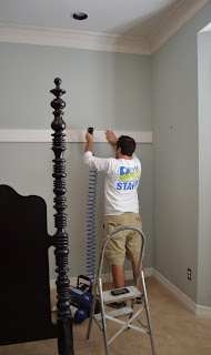
First, we decided how high we wanted our header to be and nailed it in place.  We made this judgment based on the height of the headboard posts.  We used our nail gun for this project (fortunately, we were smarter this time than we were here with the DIY concrete planters).  From there, we measured and determine the width of each "column" and started to nail our boards into place.  We beveled the bottom of each column board to give a smoother transition into the baseboards.

After all of our column boards were in place, we put our rows into place (I feel like I'm talking in Excel speak :)).  We worked from the center to the outside and used a miter saw to cut each piece to fit precisely.  Fortunately, we only had one board that crossed over a light switch or outlet.  We put it in place last and beveled those edges as well.  

Finally, we had all of the boards in place.


As you can see in this detailed picture, the unpainted boards don't look perfect.  There are scuffs, nail holes and seams.  All of this can be (and was) fixed with spackle, caulk and paint.


I forgot to take a pictures, but our first finishing step was to caulk the seams where the boards met.  We used white, paintable caulk. After it dried, we sanded it smooth.  We initially only caulked the seams between boards,  but we determined that we also needed to caulk seams between the wall and the boards to get a more professional finish.  Since we couldn't sand those, we used our finger and a damp paper towel to smooth the caulk out before it dried.  Then we both set to work painting using Sherwin-Williams ProClassic Interior Latex in a gloss finish.  We used brushes and sponge rollers for the painting.  I've realized that I like the gloss paint on the boards but not on the wall.  Our walls have a slight texture on them, which is magnifiied by the gloss paint.  I plan to go back over the insets with a low-gloss paint at some point.


Here is our finished wall.  Ta da!

Again, here is where we started the day of the project.


And, here is where we are today!


I added a quilt from HomeGoods, solid white pillow shams from Pottery Barn and a pillow I made with fabric found at Fabric Factory, a local fabric store.  The lamps are from Pottery Barn and the lamps shades have been switched out for gold lamp shades found at Garden Ridge.  The bedroom paint color is Pratt & Lambert's Nickel and the paneling color is Sherwin-Williams' Greek Villa.  The project took us about 6 hours and cost approximately $100.  I think I got my money's worth on this one!!

We are still working on the finishing details of the bedding.  I'm incredibly please with the result, though. 

Many thanks to Jenny for giving me the instructions and the directions to complete this DIY project, and many thanks to my wonderful husband and our friend Kelly who helped with the project.  It was a group effort!

And, did I mention that we started this project at noon on a Saturday, and I had friends coming over for dinner that night?  I had to go to the grocery store in the middle of the project!!

PS-  As I write this, I am listening to the announcement that US miliatry forces have killed Osama bin Laden.  A proud thank you to all of the men and women serving our country who made this possible!  God bless all of them!